
Faceted maps in R
19 minute read
I recently needed to create a choropleth of a few different countries for a project on targeting of UN peacekeepers by non-state armed actors I’m working on. A choropleth is a type of thematic map where data are aggregated up from smaller areas (or discrete points) to larger ones and then visualized using different colors to represent different numeric values.
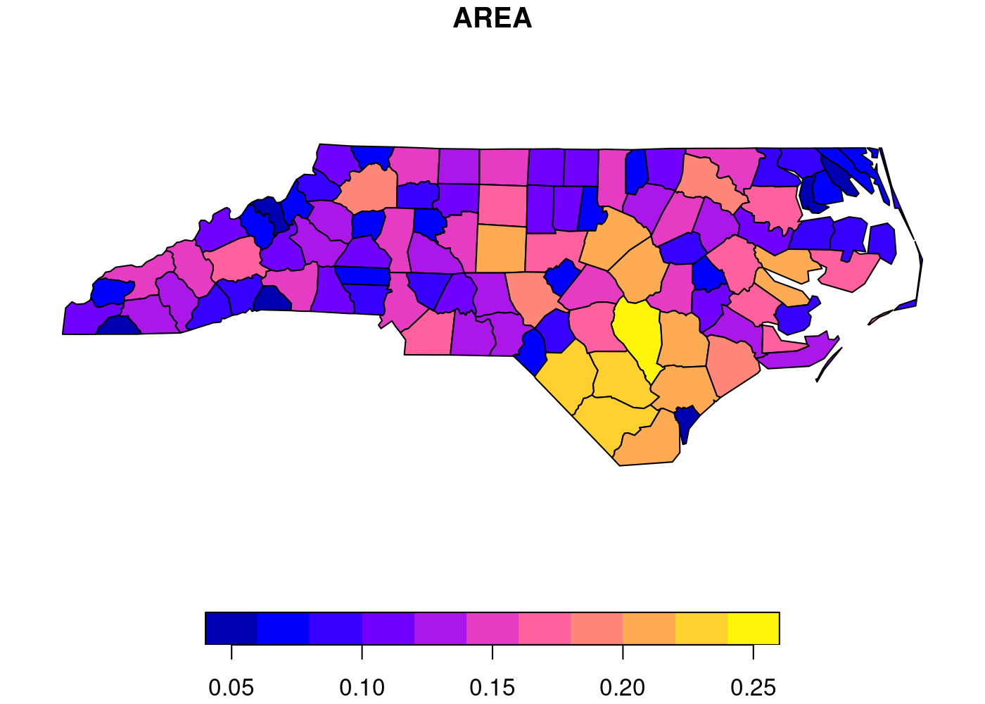
See this simple example, which displays the area of each county in North Carolina, from the sf package documentation.1 First, we need to load sf and then get the built-in nc dataset:
library(sf)
nc <- st_read(system.file('shape/nc.shp', package = 'sf'))
plot(nc[1])
 Since I needed to generate choropleths for multiple countries, I decided to use
 ggplot2’s powerful faceting functionality. Unfortunately, as I discuss below, ggplot2 and sf don’t work together perfectly in ways that become more apparent (and problematic) the more complex your plots get. I moved away from faceting, and just glued together a bunch of separate plots, but then I had to figure out how to end up with a shared legend for five separate plots. Read on to see how I solved both of these issues.
The data
I already loaded sf to make the plot of North Carolina above, so now let’s load the remaining packages we’ll use:
library(tidyverse) # data manipulation and plotting
library(tmap)      # spatial plots
library(cowplot)   # combine plots
library(RWmisc)    # clean plot theme
I’m working with cleaned and subsetted versions of ACLED and GADM, which I’ve uploaded to my website as PKO.Rdata if you want to download them and run this code yourself. The acled object contains a list of attacks on peacekeepers in active Chapter VII UN peacekeeping missions in Subsaharan Africa, while the adm object contains all of the second order administrative districts (ADM2) in the five countries with active missions.
## load data
load(url('https://jayrobwilliams.com/data/PKO.Rdata'))

## inspect
head(acled)
head(adm)
## Simple feature collection with 6 features and 30 fields
## Geometry type: POINT
## Dimension:     XY
## Bounding box:  xmin: -3.6102 ymin: 0.4966 xmax: 29.4654 ymax: 19.4695
## Geodetic CRS:  WGS 84
## # A tibble: 6 x 31
##   data_id   iso event_id_cnty event_id_no_cnty event_date  year time_precision
##     <dbl> <dbl> <chr>                    <dbl> <date>     <dbl>          <dbl>
## 1 6713346   140 CEN47283                 47283 2019-12-27  2019              1
## 2 6689432   180 DRC16211                 16211 2019-12-08  2019              1
## 3 7578005   180 DRC16182                 16182 2019-12-04  2019              1
## 4 7191069   466 MLI3253                   3253 2019-10-21  2019              1
## 5 6759702   466 MLI3225                   3225 2019-10-06  2019              1
## 6 6023339   466 MLI3224                   3224 2019-10-06  2019              1
## # … with 24 more variables: event_type <chr>, sub_event_type <chr>,
## #   actor1 <chr>, assoc_actor_1 <chr>, inter1 <dbl>, actor2 <chr>,
## #   assoc_actor_2 <chr>, inter2 <dbl>, interaction <dbl>, region <chr>,
## #   country <chr>, admin1 <chr>, admin2 <chr>, admin3 <chr>, location <chr>,
## #   geo_precision <dbl>, source <chr>, source_scale <chr>, notes <chr>,
## #   fatalities <dbl>, timestamp <dbl>, iso3 <chr>, month <dbl>,
## #   geometry <POINT [°]>

## Simple feature collection with 6 features and 19 fields
## Geometry type: MULTIPOLYGON
## Dimension:     XY
## Bounding box:  xmin: 18.54607 ymin: 4.221635 xmax: 22.395 ymax: 9.774724
## Geodetic CRS:  WGS 84
## # A tibble: 6 x 20
##   GID_0 NAME_0   GID_1  NAME_1 NL_NAME_1 GID_2 NAME_2 VARNAME_2 NL_NAME_2 TYPE_2
##   <chr> <chr>    <chr>  <chr>  <chr>     <chr> <chr>  <chr>     <chr>     <chr>
## 1 CAF   Central… CAF.1… Bamin… <NA>      CAF.… Bamin… <NA>      <NA>      Sous-…
## 2 CAF   Central… CAF.1… Bamin… <NA>      CAF.… Ndélé  <NA>      <NA>      Sous-…
## 3 CAF   Central… CAF.2… Bangui <NA>      CAF.… Bangui <NA>      <NA>      Sous-…
## 4 CAF   Central… CAF.3… Basse… <NA>      CAF.… Alind… <NA>      <NA>      Sous-…
## 5 CAF   Central… CAF.3… Basse… <NA>      CAF.… Kembé  <NA>      <NA>      Sous-…
## 6 CAF   Central… CAF.3… Basse… <NA>      CAF.… Minga… <NA>      <NA>      Sous-…
## # … with 10 more variables: ENGTYPE_2 <chr>, CC_2 <chr>, HASC_2 <chr>,
## #   ID_0 <dbl>, ISO <chr>, ID_1 <dbl>, ID_2 <dbl>, CCN_2 <dbl>, CCA_2 <chr>,
## #   geometry <MULTIPOLYGON [°]>
First attempt: ggplot2
The first step we need to do is associate each individual attack with the ADM2 it occurred in. We can do this with the st_join() function. This function executes a left join by default, so by using adm for the x argument and acled for the y argument, we end up with one row for every ADM2 with no attacks in it, and n rows for each ADM2 with attacks in it, where n equals the number of attacks in that ADM2. We can then use group_by() and summarize() to create a count of attacks for each ADM2 by summing the number of non-NA observations of event_id_cnty, the main ID field in ACLED. Finally, I log this count variable (using log1p() to account for the ADM2s without any attacks because ln(0) is undefined) to make the resulting plot more informative due to outliers in Northern Mali and the Eastern DRC. Putting it all together:
st_join(adm, acled) %>%
  group_by(NAME_0, NAME_1, NAME_2) %>%
  summarize(attacks = log1p(sum(!is.na(event_id_cnty)))) %>%
  ggplot(aes(fill = attacks)) +
  geom_sf(lwd = NA) +                 # no borders
  scale_fill_continuous(name = 'PKO targeting\nevents (logged)') +
  theme_rw() +                        # clean plot
  theme(axis.text = element_blank(),  # no lat/long values
        axis.ticks = element_blank()) # no lat/long ticks
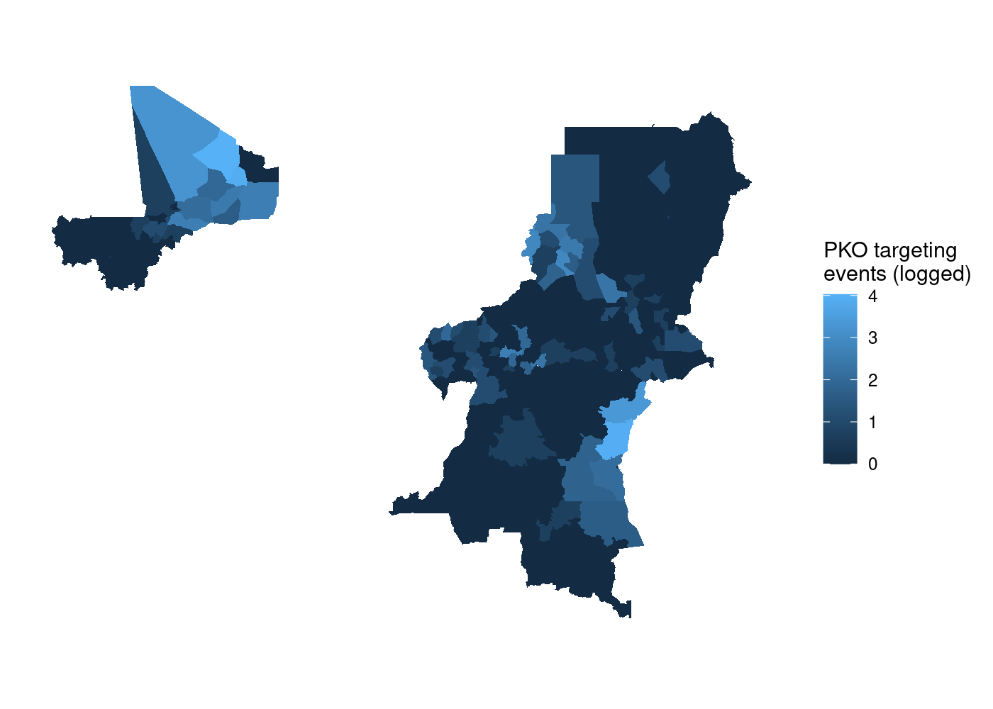 That’s a lot of wasted white space, and it can make certain countries harder to see. Let’s split it out using
 facet_wrap(). We simply add a facet_wrap() call to our ggplot2 code, and tell it to split by our country name variable, NAME_0:
adm %>%
  st_join(acled) %>%
  group_by(NAME_0, NAME_1, NAME_2) %>%
  summarize(attacks = log1p(sum(!is.na(event_id_cnty)))) %>%
  ggplot(aes(fill = attacks)) +
  geom_sf(lwd = NA) +
  scale_fill_continuous(name = 'PKO targeting\nevents (logged)') +
  facet_wrap(~ NAME_0) +
  theme_rw() +
  theme(axis.text = element_blank(),
        axis.ticks = element_blank())
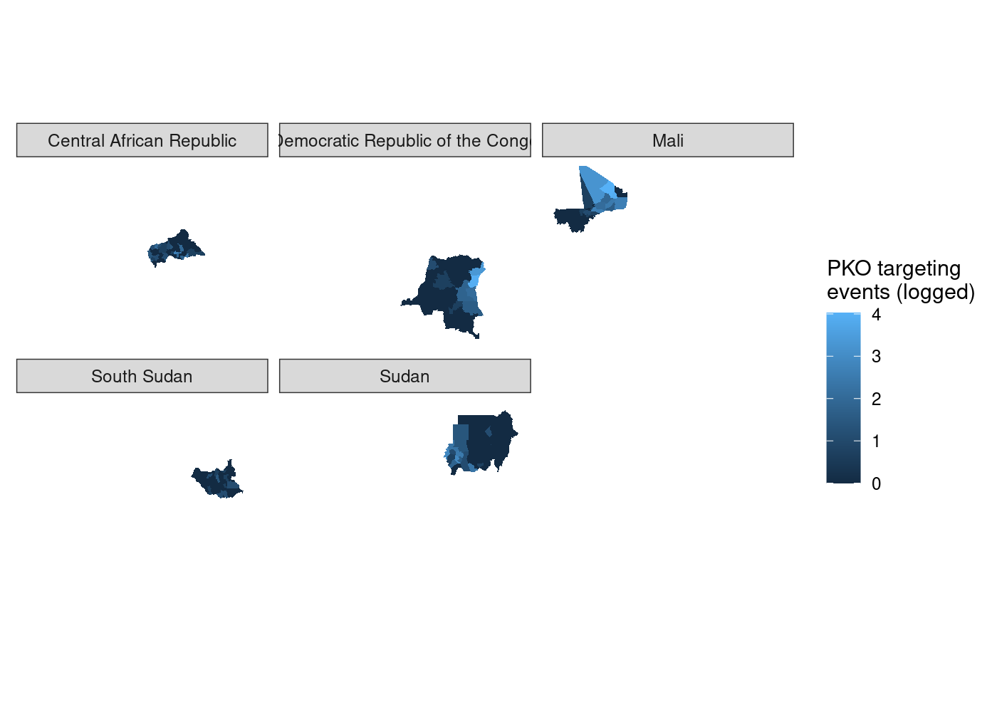 We’ve got facets, but everything is still clearly on the same scale. let’s set
 scales = 'free' in our call to facet_wrap() to try and fix that.
st_join(adm, acled) %>%
  group_by(NAME_0, NAME_1, NAME_2) %>%
  summarize(attacks = log1p(sum(!is.na(event_id_cnty)))) %>%
  ggplot(aes(fill = attacks)) +
  geom_sf(lwd = NA) +
  scale_fill_continuous(name = 'PKO targeting\nevents (logged)') +
  facet_wrap(~ NAME_0, scales = 'free') +
  theme_rw() +
  theme(axis.text = element_blank(),
        axis.ticks = element_blank())
## Error: coord_sf doesn't support free scales
And we get an error. It turns out the the ggplot2 codebase assumes that it can maniulate axes independently of one another. This is very much not the case with geographic data where a meter vertically needs to equal a meter horizontally, so coord_sf() locks the axes in much the same manner as coord_fixed().2 To try and get around the limitations from ggplot2’s non-spatial origins, I turned to a package written from the ground up for plotting spatial data.
Second attempt: tmap
My googling led me to this Stack Overflow answer extolling the virtue of the tmap package.3 tmap is a package for drawing thematic maps from sf objects using a syntax very similar to ggplot2. We can reuse the same data wrangling code and as before pipe it into our plotting function, which this time is tm_shape(). We then add a call to tm_polygons() to get our colored features and tm_facet() to split them apart. Note that unlike ggplot2, we need to quote the names of variables in tmap functions:
st_join(adm, acled) %>%
  group_by(NAME_0, NAME_1, NAME_2) %>%
  summarize(attacks = log1p(sum(!is.na(event_id_cnty)))) %>%
  tm_shape() +
  tm_polygons('attacks', title = 'PKO targeting\nevents (logged)') +
  tm_facets('NAME_0')
Much better so far! However, notice that tmap defaults to assuming that our attacks variable is discrete. We’ll need to tell it that it’s continuous. And what if we moved that legend down to the bottom right to get rid of the wasted space currently there?
adm %>%
  st_join(acled) %>%
  group_by(NAME_0, NAME_1, NAME_2) %>%
  summarize(attacks = log1p(sum(!is.na(event_id_cnty)))) %>%
  tm_shape() +
  tm_polygons(col = 'attacks',
              title = 'PKO targeting\nevents (logged)',
              style = 'cont') +                  # continuous variable
  tm_facets('NAME_0') +
  tm_layout(legend.outside.position =  "bottom", # legend outside below
            legend.position = c(.8, 1.1))        # manually position legend
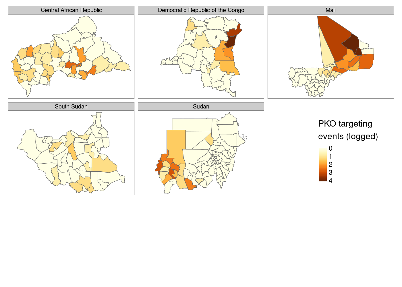
This is…fine. You’ll notice that there’s a lot of white space at the bottom of the plot, which I still haven’t figured out how to eliminate, and I personally prefer the color palette options available in ggplot2. Finally, there’s not much control over the legend compared to what you get with ggplot2, so let’s head back there and try to come at this problem from a different direction.
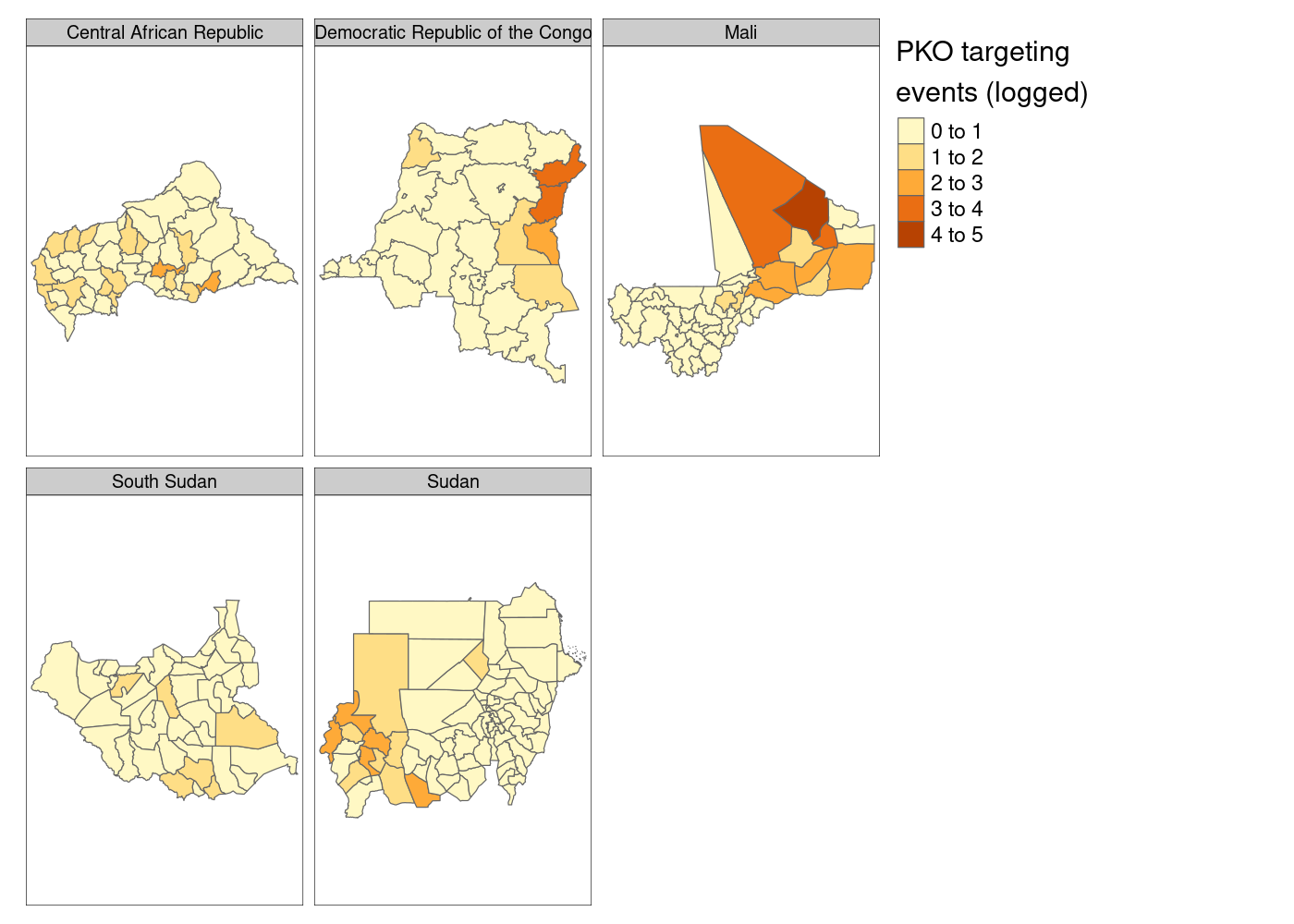
Third attempt: cowplot
While we’re still using ggplot2 to make individual plots, we need some way to combine them into a final plot. We can rely on the plot_grid() function in the cowplot library for that.4 We need to create five subplots, which we could do manually, but let’s do it programmatically because at some point you may need to do this for 27 different countries. The best way to store our five subplots is in a list, because lists in R can contain any type of R objects as their elements.5 I’m going to use the map() function from the purrr package to accomplish this, but you could also use lapply(). map() takes a list as its first argument, .x and a function as its second, .f. To see how map works, look at the following example:
map(1:3, sample)
## [[1]]
## [1] 1
##
## [[2]]
## [1] 1 2
##
## [[3]]
## [1] 2 3 1
map() returns a list of length 3 because our input .x was a vector of length three, and it applies the function .f to each element of .x. I’m going to use an anonymous function to filter adm to only contain ADM2s from one country at a time, then create our subplots separately like we did together above:
pko_countries <- c('Central African Republic', 'Democratic Republic of the Congo',
                   'Mali', 'South Sudan', 'Sudan')

## create maps in separate plots, force common scale between them
maps <- map(.x = pko_countries,
            .f = function(x) adm %>%
              filter(NAME_0 == x) %>%
              st_join(acled) %>%
              group_by(NAME_0, NAME_1, NAME_2) %>%
              summarize(attacks = log1p(sum(!is.na(event_id_cnty)))) %>%
              ggplot(aes(fill = attacks)) +
              geom_sf(lwd = NA) +
              scale_fill_continuous(name = 'PKO targeting\nevents (logged)') +
              theme_rw() +
              theme(axis.text = element_blank(),
                    axis.ticks = element_blank()))
We can either supply each individual subplot to plot_grid() separately, or we can use the plotlist argument to pass a list of plots; good thing we saved them in a list:
## use COWplot to combine and add single legend
plot_grid(plotlist = maps, labels = LETTERS[1:5], label_size = 10, nrow = 2)
I tried using the name of each country as the subplot label, but because label positioning is relative to the width of labels it was impossible to get them all nicely left-aligned. As a result, I had to settle on using letters to label the subplots and then identifying them in the figure caption in text. As you’ll see later, there’s no perfect way of accomplishing this and you’ll have to make a trade-off somewhere.
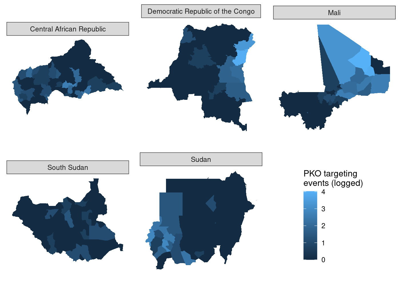
Setting aside that compromise, there’s still one issue with this plot that we can fix. We’re measuring the same thing (attacks on UN peacekeeping personnel) in all five choropleths, so there’s no need for five separate scales.
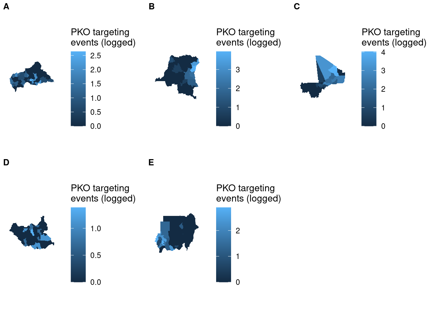
Shared legend
The cowplot documentation demonstrates how to use the get_legend() function to extract the legend from one of the subplots and then add it as another element to plot_grid(), placing it in the bottom right like we sort of managed to do with tmap. However, we need to add theme(legend.position = 'none') to the ggplot call for each subplot, otherwise we’ll just end up with six legends. That means we need to apply to each element of our list of maps, which means it’s another job that map() is perfect for! We’ll use map() to take each subplot in maps and remove the legend from it, then use get_legend() to add a legend in the bottom right.
## use COWplot to combine and add single legend
plot_grid(plotlist = c(map(.x = maps,
                           .f = function(x) x + theme(legend.position = 'none'))),
          get_legend(maps[[1]]),
          labels = LETTERS[1:5], label_size = 10, nrow = 2)
 This doesn’t look right! We told
 plot_grid() to start with our maps, so why is the legend the first thing in the plot? If you look closely at the documentation for plot_grid(), you’ll see that the ... argument comes before the plotlist argument in the function definition. Even when we specify plotlist first, the function will add plotlist after ....6 To fix this, all we need to do is concatenate the results of get_legend() with the results of our call to map(). Note that we need to first transform the former to a list with list(), otherwise each element of it will be concatenated separately rather than as a grob object:
## use COWplot to combine and add single legend
plot_grid(plotlist = c(map(.x = maps,
                           .f = function(x) x + theme(legend.position = 'none')),
                       list(get_legend(maps[[1]]))),
          labels = LETTERS[1:5],
          label_size = 10,
          nrow = 2)

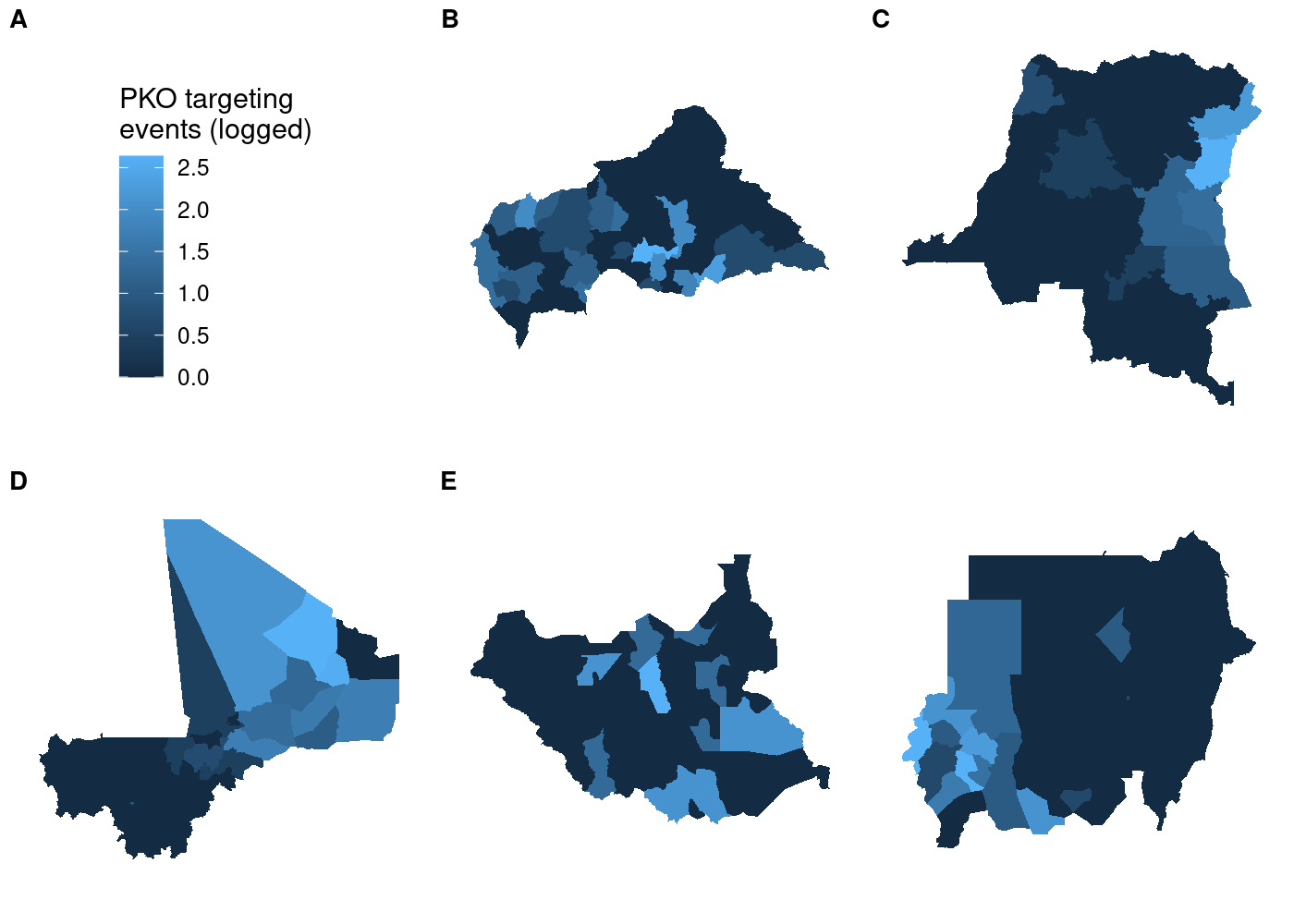
So far so good. But if we try using a different map in our call to get_legend(), things get weird:
## use COWplot to combine and add single legend
plot_grid(plotlist = c(map(.x = maps,
                           .f = function(x) x + theme(legend.position = 'none')),
                       list(get_legend(maps[[4]]))),
          labels = LETTERS[1:5], label_size = 10, nrow = 2)
 Each subplot has its own unique legend that’s automatically generated from the values of
 attacks it contains. This is even worse than it might seem at first glance, because it means that the various subplots are in no way comparable to one another!
Accurate shared legend
To avoid misrepresenting the data, we need to ensure that each subplot has the same legend. The easiest way to do this is to manually set the legend for each subplot in our call to scale_fill_continuous(). Even though we’re manually setting the bounds of the legend, that doesn’t mean we have to hard code them. We can use a simpler version of our code to join attacks to ADM2s and then calculate the highest number of attacks across all countries in the data. Then we take advantage of the fact that scale_fill_continuous() can pass additional parameters to continuous_scale() via the ... argument. The continuous_scale() function is a low-level function used throughout ggplot2 to construct continuous scales, and it has a limits argument that sets the bounds of the scale. All we have to do is pass the minimum and maximum (logged) numbers of attacks in the data and we’re in business:
st_join(adm, acled) %>%
  st_drop_geometry() %>%   # we don't need a map at the end; drop geometry to speed up
  group_by(NAME_0, NAME_1, NAME_2) %>%
  summarize(attacks = log1p(sum(!is.na(event_id_cnty)))) %>%
  pull(attacks) %>%        # extract attacks variable
  range() -> attacks_range # get min and max

## create maps in separate plots, force common scale between them
maps_shared <- map(.x = pko_countries,
                   .f = function(x) adm %>%
                     filter(NAME_0 == x) %>%
                     st_join(acled) %>%
                     group_by(NAME_0, NAME_1, NAME_2) %>%
                     summarize(attacks = log1p(sum(!is.na(event_id_cnty)))) %>%
                     ggplot(aes(fill = attacks)) +
                     geom_sf(lwd = NA) +
                     scale_fill_continuous(limits = attacks_range,
                                           name = 'PKO targeting\nevents (logged)') +
                     theme_rw() +
                     theme(axis.text = element_blank(),
                           axis.ticks = element_blank()))
Now all that’s left is to use plot_grid() to put it all together:
## use COWplot to combine and add single legend
plot_grid(plotlist = c(map(.x = maps_shared,
                           .f = function(x) x + theme(legend.position = 'none')),
                       list(get_legend(maps_shared[[1]]))),
          labels = LETTERS[1:5], label_size = 10, nrow = 2)
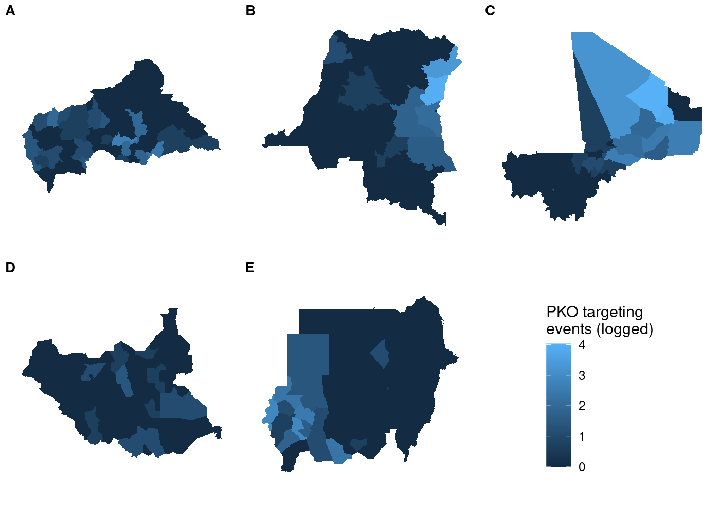
And unlike before, the legend is identical regardless of which subplot we use with get_legend():
## use COWplot to combine and add single legend
plot_grid(plotlist = c(map(.x = maps_shared,
                           .f = function(x) x + theme(legend.position = 'none')),
                       list(get_legend(maps_shared[[4]]))),
          labels = LETTERS[1:5], label_size = 10, nrow = 2)

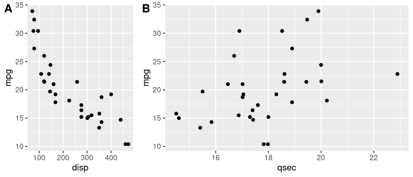
This approach is still useful even if you’re not working with spatial data. plot_grid() is powerful because it lets you make asymmetric arrangements like this example from the cowplot documentation:
p1 <- ggplot(mtcars, aes(disp, mpg)) +
  geom_point()
p2 <- ggplot(mtcars, aes(qsec, mpg)) +
  geom_point()

plot_grid(p1, p2, labels = c('A', 'B'), rel_widths = c(1, 2))
If the units you’re faceting by contain substantially different observations, you might end up in a situation where the automatically generated legends are different from one another. Manually creating the scale of the legend and ensuring it’s the same for all plots would solve this problem here, too.
Bonus: still to solve
Don’t let anyone convince you they know everything. I still haven’t managed to get my ideal (conditional on regular faceting with facet_wrap() being out of the question) solution to this working. I tried to create five subplots and just add a facet label to each, with each one being a facet of one panel. Straightforward enough, right?
maps_facet <- map(.x = pko_countries,
                  .f = function(x) adm %>%
                    filter(NAME_0 == x) %>%
                    st_join(acled) %>%
                    group_by(NAME_0, NAME_1, NAME_2) %>%
                    summarize(attacks = log1p(sum(!is.na(event_id_cnty)))) %>%
                    ggplot(aes(fill = attacks)) +
                    geom_sf(lwd = NA) +
                    scale_fill_continuous(limits = attacks_range,
                                          name = 'PKO targeting\nevents (logged)') +
                    facet_wrap(~NAME_0) +
                    theme_rw() +
                    theme(axis.text = element_blank(),
                          axis.ticks = element_blank()))

plot_grid(plotlist = c(map(.x = maps_facet,
                           .f = function(x) x + theme(legend.position = 'none')),
                       list(get_legend(maps_facet[[1]]))),
          nrow = 2)
Not so much, and no amount of tinkering with the align and axis arguments to plot_grid() has yielded any improvement. The specific paper this plot is for doesn’t have any other plots with facets, so I’m content to go with my inelegant solution of lettered labels and a key to them in the figure caption. If that weren’t the case, I might still be fiddling with this and getting deeper and deeper into the source code for plot_grid().
If you’re wondering why the largest county area is in the ballpark of 0.25, it’s because the data are in square degrees, an old non-SI unit of measurement that’s defined in terms of how much the field of view from a given point is obstructed by an object. GIS is so easy these days, folks. ↩
The more I learn about how
ggplot2andsfwork under the hood, the more amazed I am thatgeom_sf()Just Works in 80% of cases, let alone works at all. ↩The answer also listed the
geom_spatial()function from theggspatialpackage as an alternative option, but I couldn’t get it to work. The answer is three and a half years old, which means it’s very possible something changed in eithersforggspatialthat broke this solution. So it goes. ↩It’s much more powerful and easily customizable than
gridExtra::grid.arrange(). ↩They can also contain heterogeneous elements which will come in handy later. ↩
If you check out the actual source code of
plot_grid(), line 9 shows you that the function is indeed putting...ahead ofplotlist:plots <- c(list(...), plotlist). ↩